Cover to cover
We connected with the visual artists nominated for this year’s ‘Best Album Artwork’ JUNO about their collaborative work with musicians.
Image courtesy of Sarah Marcotte-Boislard.
This Sunday, May 15, we celebrate another year of musical achievement in Canada with the 51st Annual JUNO Awards. While most of the evening’s prizes will be handed out for genres ranging from Electronic to Contemporary Roots, the event will also acknowledge art created in mediums other than music.
Album artwork plays a crucial role in conveying the concept and visual expression of a body of music. Graphic designers, photographers, painters and other visual artists can help musicians invite fans into a world that communicates with both their eyes and ears.
We caught up with some of the visual artists nominated for the year’s ‘Best Album Artwork’ JUNO. They reflected on what it’s like to create the face of an album, and shared details about their collaborative process with each musician.
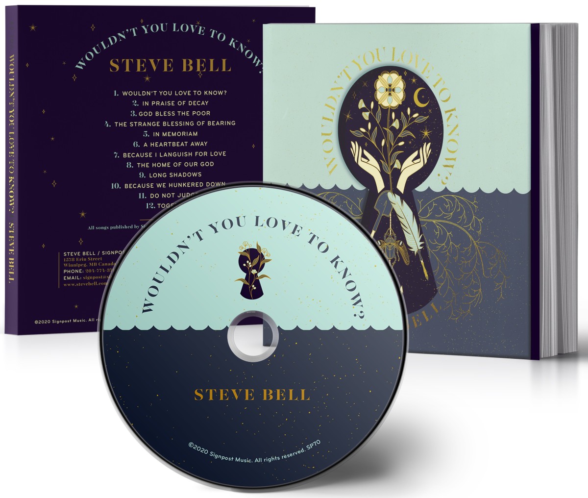
Steve Bell – Wouldn’t You Love to Know, artwork by graphic artist Roberta Landreth
AGOinsider: Can you describe your approach to creating this album artwork? What was your inspiration?
Landreth: As always, the inspiration for the album artwork is generated from listening to the music and talking with the artist about the songs. For the cover we decided on a keyhole, to underline this idea of wonder that is central to the album and seeking knowledge — a child looking into a room through a keyhole and discovering something new. The keyhole is meant to signify wonder and openness, we can approach any unknown with love so that even the most polarizing topic can be understood with the heart.
AGOinsider: Can you describe your collaborative process with the artist? What did you discuss and what was their vision for their album cover?
Landreth: Doing the album artwork for a Steve Bell project is always such a treat. This album has a companion book, where each song becomes a chapter about the themes within the album. The way Steve expresses himself is always layered with metaphor and symbol…he leaves the design side of things to me, but the soil to draw inspiration from his projects is always super-fertile. For this project, I would read a chapter, listen to the song and then create an illustration to accompany each one.
AGOinsider: Can you describe your approach to creating this album artwork? What was your inspiration?
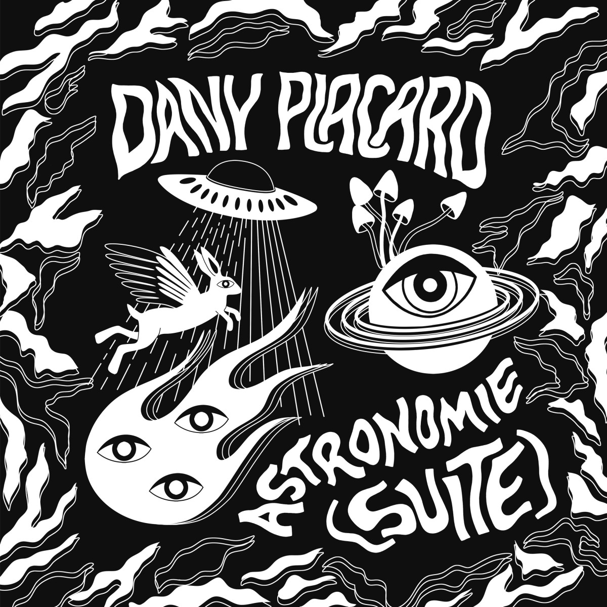
Marcotte-Boislard: Every time that I work on an album artwork, I submerge myself in the artist's musical world. Because to me creating is really a matter of feeling, I only listen to the album that I am working on in order to let its mood permeate my creation process.
For Dany Placard's album, I wanted to explore the psychedelic aspect of his music, with strong contrasts, almost hypnotizing with the black and white, the lines and the forms.
AGOinsider: Can you describe your collaborative process with the artist? What did you discuss and what was their vision for their album cover?
Marcotte-Boislard: For Dany, we talked a lot about the direction he wanted to take, but also about his creation process when writing music. The album does not have a precise message, it's more on the abstract side, like a trip (with all its meaning). It was clear to us that the cover had to reflect this psychedelic side, a bit dreamy, that gives room for interpretation. Later on, as I really like when my work reflects the artist's own, there is a lot of communication as the project progresses. Dany is someone who leaves a lot of space and freedom to the people he works with. It's paramount for him and I believe it's reflected in his projects.
Louis Jean-Cormier – La Ciel Est Au Plancher, artwork by graphic designer and illustrator Sarah Marcotte-Boislard (Image at top)
AGOinsider: Can you describe your approach to creating this album artwork? What was your inspiration?
Marcotte-Boislard: For Louis-Jean's album, I started working on the cover at the same time it was being recorded. What I had been provided to start with were raw songs, and layers of instruments and lyrics were added during my work. This allowed me to build a visual in parallel. The music was inspiring something atmospheric and vast to me. I wanted to make a cover that can be looked at in all directions, illustrating a trajectory.
AGOinsider: Can you describe your collaborative process with the artist? What did you discuss and what was their vision for their album cover?
Marcotte-Boislard: Before working on the cover of Le Ciel Est Au Plancher, we discussed a lot with Louis-Jean. He described the reasons behind this creation, the themes, and the context in which he wrote it. Together we brainstormed on symbols (like astronomy, space, stars, cardinal points, love, etc.) and a guideline, building a toolkit for me to create an artwork that will translate his music in the best way possible. All of this with lots of freedom, generosity and trust from him.
AGOinsider: Can you describe your approach to creating this album artwork? What was your inspiration?
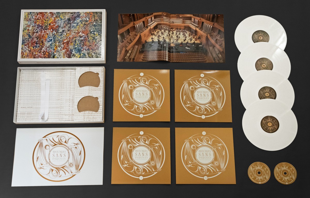
Nelson: Since the project was about translating Harmonium’s mystical music into orchestral symphonies, a decision was taken early to have pictures of the Orchestre Symphonique de Montréal and all major musical collaborators during the recording sessions at the center of the visual content. It then seemed only natural to use some of the music score sheets as complementary graphic elements, presented inside the box set like a wallpaper filled with overwhelming, beautiful music.
AGOinsider: Can you describe your collaborative process with the artist? What did you discuss and what was their vision for their album cover?
Nelson: Serge Fiori, Harmonium’s leader and singer, is a tremendous fan of Jean-Paul Riopelle’s work. So once Riopelle succession’s authorized for the very first time the use and reproduction of one of his paintings (Le Jacob-Chatou,1954), we knew we had a cover that perfectly represented the album’s title and spirit “Histoires sans paroles / Stories without words”. Mr. Fiori is a very reserved and spiritual person and wanted something additional to all of this so, after a few sketches, I came up with this clock without numbers inspired by the Hermit tarot card. Placed into an ever-turning circle, two holy identical beings rotate together and bring succeeding light and darkness onto our world, cultivating life and all kinds of stories without words.
Tune in to CBC this Sunday, May 15 and see who takes home the JUNO for ‘Best Album Artwork’.
Stay tuned to the AGOinsider for more art news from the AGO and beyond.


