Designing a home fit for a monster

When Katy Chey applied for the role of exhibition designer at the AGO, she knew she wanted to work on one exhibition in particular: Guillermo del Toro: At Home with Monsters. And once you experience the show after it opens on September 30, you’ll understand why. This installation goes far beyond what we’re used to. Chey and the project team behind At Home with Monsters have turned the entire Sam & Ayala Zacks Pavilion gallery space into the otherworldly, gothic home called Bleak House – a re-creation of del Toro’s famed residence in Los Angeles.
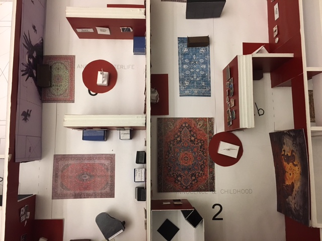
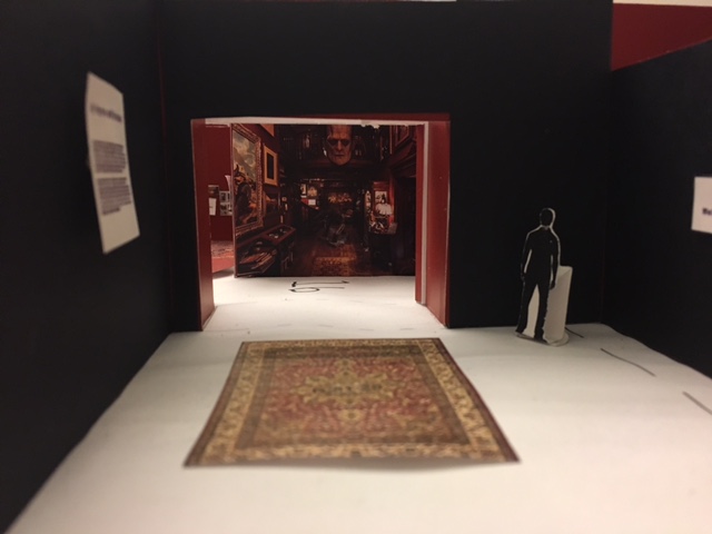
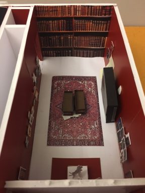
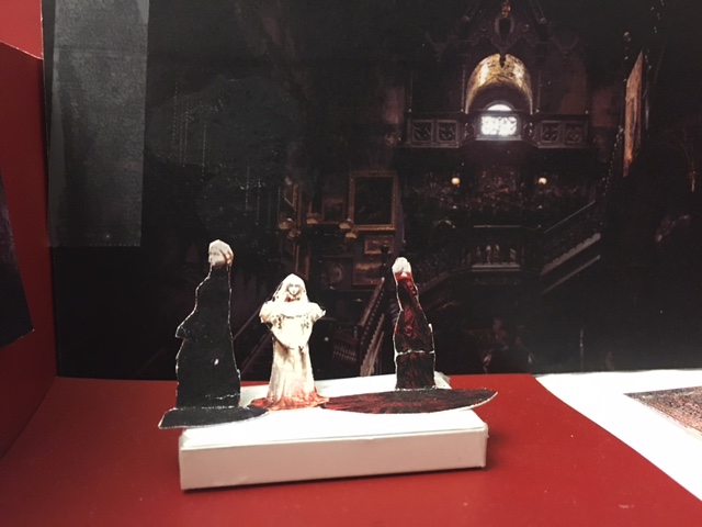
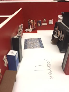
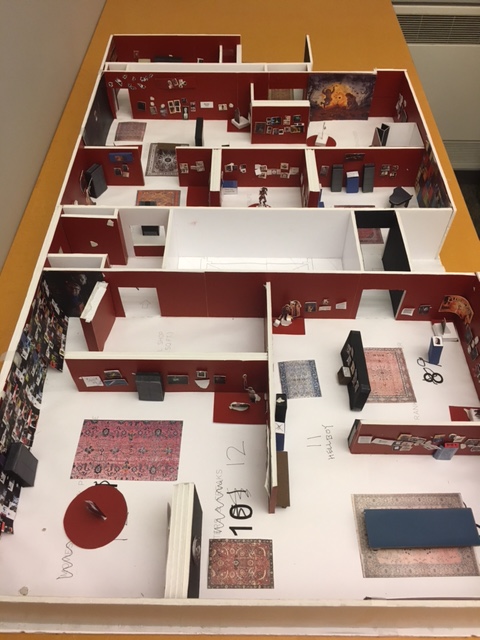
Take a look at these photos of our 3D model to get an idea of what’s in store.
We spoke to Katy to learn more about what an exhibition designer does, and what makes At Home with Monsters such a special project to work on.
AGO: What does an exhibition designer do?
Katy: We develop, prepare and test design ideas for an exhibit. An exhibition designer also ensures that the art fits within the gallery space, leaves plenty of room for visitors and, most importantly, looks amazing. In the case of Guillermo del Toro: At Home with Monsters, my job has been to transform the gallery space into a kind of replica of del Toro’s own home, Bleak House, so visitors feel like they’re transported.
AGO: What made At Home with Monsters different from other exhibitions?
Katy: The role remains the same, but everything is multiplied. There is a lot more of everything in this show; themes, moments of surprise and discovery, objects and artworks. So there is a lot more design ideas to develop and test. I’ve been working closely with curator Jim Shedden and the whole exhibition team to come up with a design that will be very unique and exciting and true to del Toro’s aesthetic and imagery. Every week we had team screenings of del Toro’s work, as well as some of his favourite films, to get immersed into his style. The exhibition design tries to reflect that.
AGO: You have experience as an architect. How does that influence how you approach designing this exhibition?
Katy: It gives me the technical drawing skills, and the ability to think three dimensionally. This background also allows me to quickly visualize ideas, work under deadlines, and work well in a team setting.
AGO: How do 3D models help in the process?
Katy: Models enable ideas to be tested dimensionally, and quickly provide a clear understanding of how the design will look in real life. Particularly with At Home with Monsters, where there are many items at different scales, a model is useful to help instantly visualize the large number of works that need to be displayed. Models aren’t always used in exhibition designs, but I think they’re invaluable. It’s time-consuming to build them—you’re printing out tiny to-scale images, putting on foam core backing, and carefully placing them in specific places in the model—and the changing nature of exhibitions means that the model is never really finished. But it’s great to discuss a possible change and immediately see what it would look like in reality with the model.
AGO: Without giving too much away, what are you most excited for visitors to see inside the exhibition?
Katy: The art, of course! But especially the Faun from Pan’s Labyrinth. Look carefully and you will see something nestled in the back of his leg.
Are you an AGOinsider yet? If not, sign up to have stories like these delivered straight to your inbox every week.
Lead Supporters
Lead Supporters
Supporting Sponsor
Supporting Sponsor
Government Partner
Government Partner
Media Partner
Media Partner

