
Cover me
We spoke with five artists from the 2021 Polaris Music Prize short list about the concept and inspiration behind their album artwork.

Image courtesy of Cadence Weapon.
When you think about your favourite albums, chances are the cover artwork of each is permanently etched in your memory, along with its most potent melodies and quotable lyrics. The collaborative relationship between musicians and visual artists has resulted in countless iconic album covers that help amplify music’s impact on pop culture. Over the span of his career, Andy Warhol created album covers for some of music’s most important figures including Diana Ross, Thelonious Monk, and The Velvet Underground. This aspect of his practice is showcased as part of Andy Warhol, on view now at the AGO.
In celebration of album artwork, we connected with five artists who recently made the short list for Canada’s highly-coveted 2021 Polaris Music Prize. We asked each artist for some conceptual insight about their album artwork, as well as a statement from the designer/artist that created it. Check it out below, and be sure to give each album a listen after you’re done.
Klo Pelgag – Notre-Dame-des-Sept-Douleurs
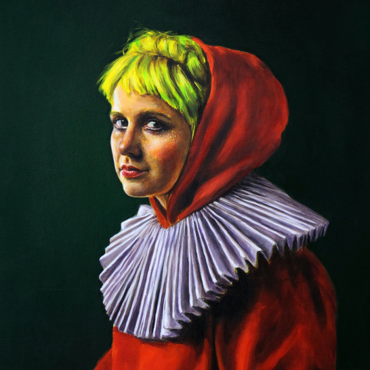
Image courtesy of Klo-Pelgag.
Klo Pelgag : As this album digs deep in my personal life, I wanted the cover to be more direct than my previous albums. I knew I wanted to collaborate with Florence Obrecht, a painter whose work I love, as well as David and Julien, two designers that are also friends of mine, whom I collaborated with for the past albums.
Julien Herbert & David Beauchemin (designers): After an initial talk with Chloé, right after the album was recorded, we got a sense that it was darker then her previous ones. It speaks about loss, but also about hope. The biggest concept that we wanted to bring forward was this idea of contrast, between light and dark, old and new, life and death. We first narrowed down the style, the colour palette, and the packaging design. We helped to keep a consistent art direction throughout the whole project, assisting the photoshoot, giving Florence (the painter) feedback, and all those small details that we think make a big difference in the final product. We also followed up with the campaign of her album launch and merch. It was all about giving a visual reflection of the album.
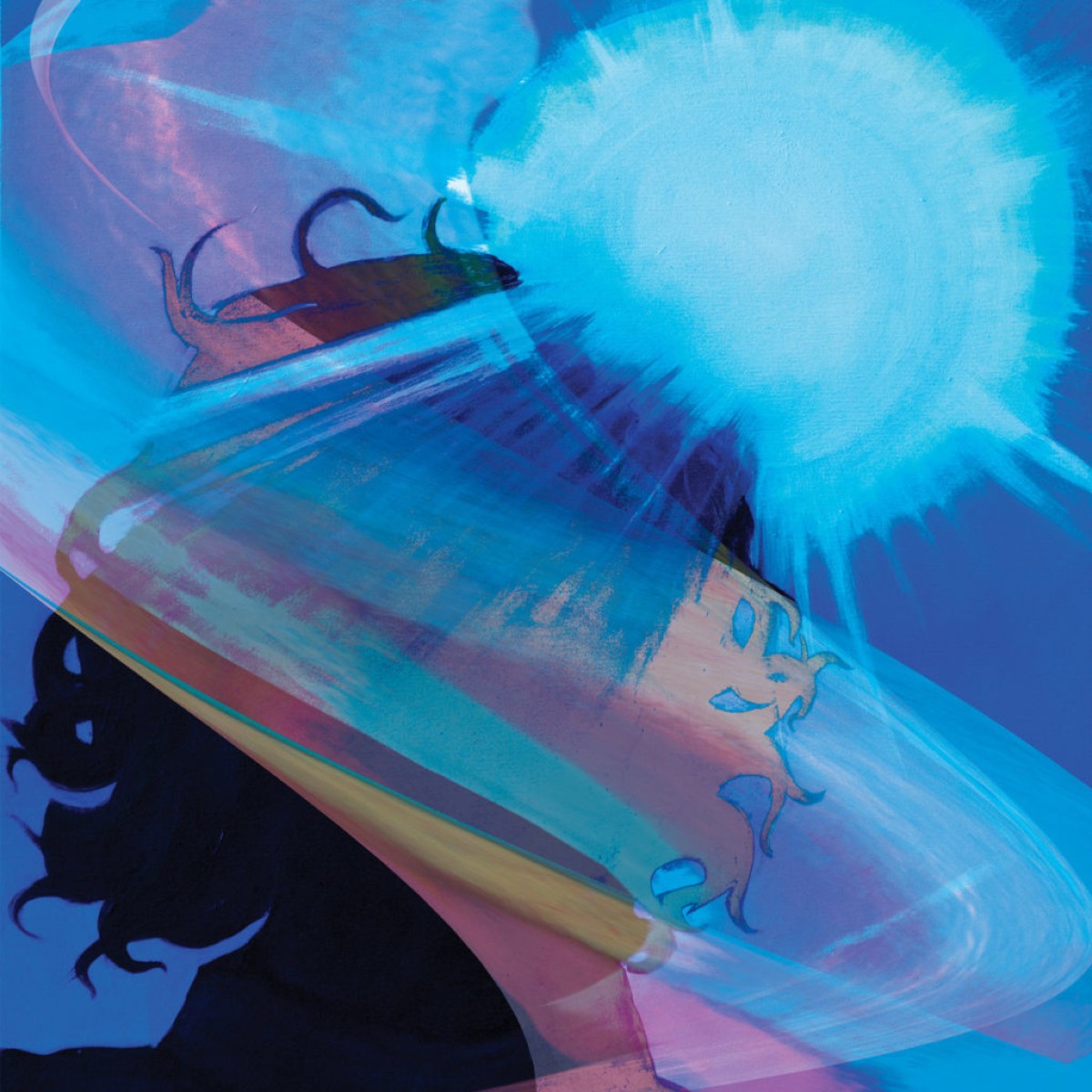
Image courtesy of Zoon
Zoon: For me writing Bleached Wavves was a very cathartic experience. I left music in 2010 to start my healing journey to focus on my mental health & preparing myself for a better life, but also so I could do music again. While recording Bleached Wavves I wrote, recorded, and basically did everything myself in my tiny bedroom in Hamilton, Ontario. Near the end of recording Bleached Wavves I started to wonder about the artwork. I wanted it to represent my writing process and also a way to be proud of the work I did alone. One day while on a walk with my friend Jon Tiberi I snapped a selfie of myself with the sun in the background. I also sing a lot about light and sun because both of those affect and trigger my creative side. Also the sun plays a big role in my Ojibway culture. I knew that the selfie wasn’t exactly what I wanted so I commissioned my then partner to explore and reimagine it. The end result was something truly beautiful. - Daniel Monkman (Zoon)
Danielle Roberts (visual artist): Daniel and I have always really inspired each other creatively. We have been friends for many years and have a very deep understanding of each other's practice and intentions. Since I am a painter and not a graphic designer it was important to me that I be able to combine my own practice in a way that felt true to myself with what Dan wanted for his album cover. One aspect of our practices that we have always echoed each other is our interest in light. When I listen to this record I see a lot of light. So when Daniel came to me with his idea that was based on a selfie, I knew we had to do something with abstract light. First I painted his silhouette from his original photo with the sun behind his head. Then I digitally manipulated images of my own paintings which are full of radiant coloured light. I stretched and warped the images from my paintings over and across the portrait that I had made of Daniel's face." - Danielle Roberts (artist)
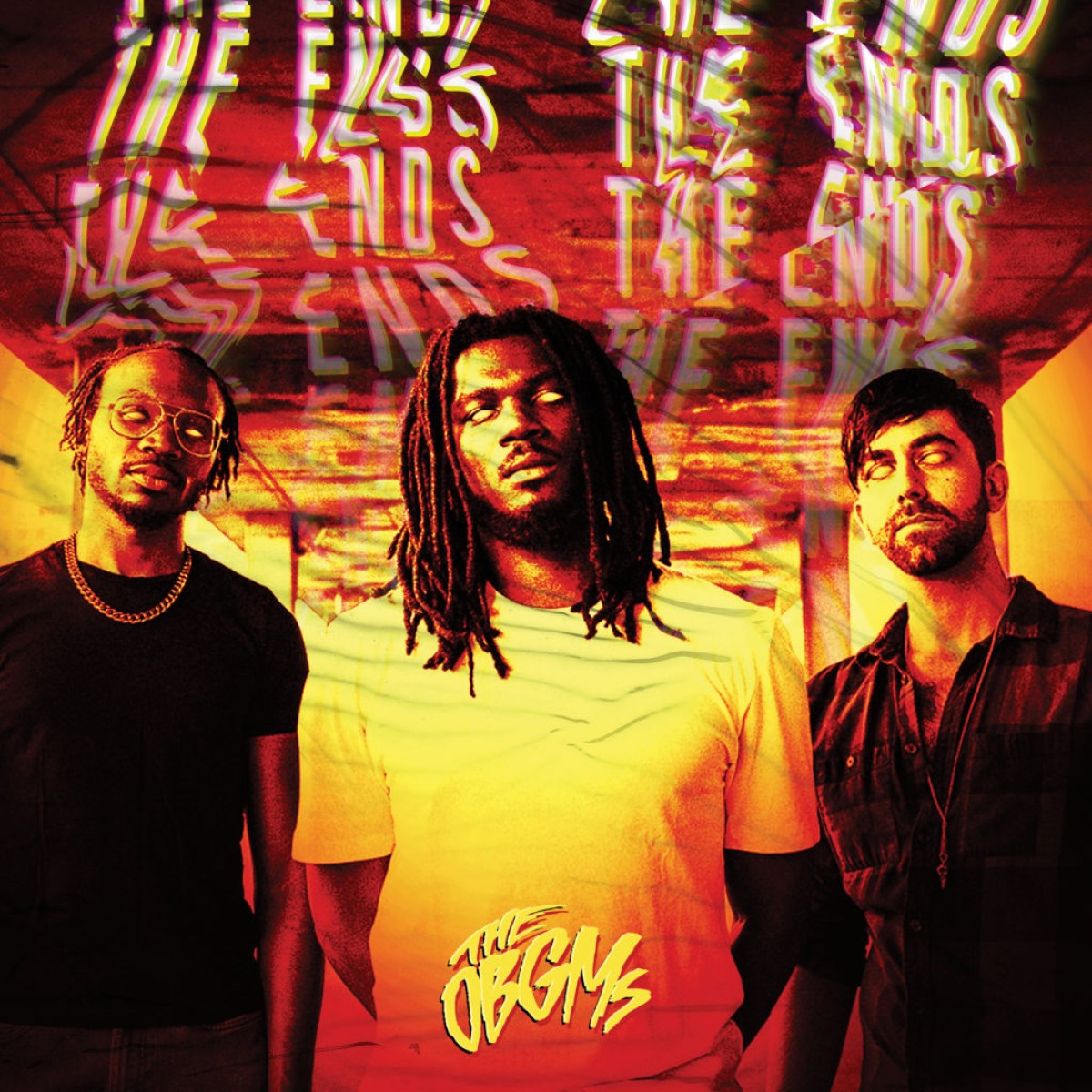
Image courtesy of The OBGMs.
Colanthony Humphrey (band member and creator of the artwork): The Ends being conceptualized visually is the embodiment of several endings: the end of being slept on, the end of being taken lightly, the end of bad relationships, and quite frankly, the end of this band if this album doesn't raise us to the next level. The zombification of the band is exactly that becoming the scariest presence on the scene, or a dead band. The hot colours of bringing hell or burning in hell. And finally, the back cover is of The Ends: Eglinton West, which is where the band started 15 years ago. Front cover photography by Amanda Fotes. Back cover photography by Colanthony Humphrey.
Leanne Betasamosake Simpson – Theory of Ice
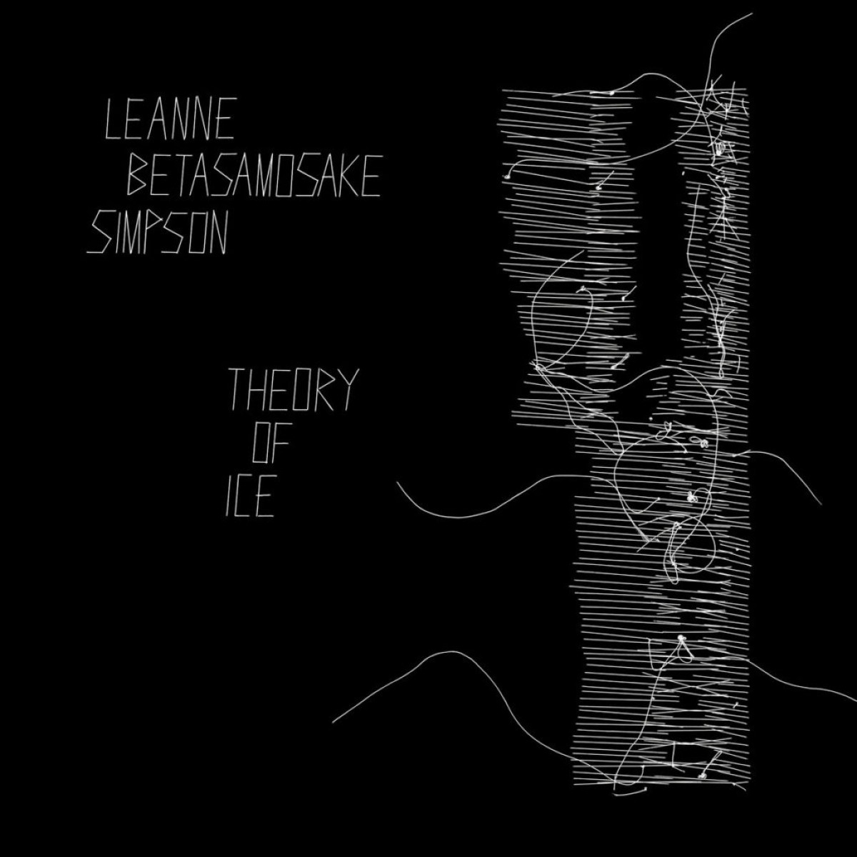
Image courtesy of Leanne Betasamosake Simpson.
Leanne Betasamosake Simpson: It is important to me to bring my work into conversation with other artists working in different mediums. Theory of Ice is a constellation of artists and their practices working in commune with each other to layer meaning and help the work travel in the world. The lyrics for Theory of Ice are based on poems found in my novel Noopiming, and Fringe by Rebecca Belmore appears on the cover of the book. The visual art in Theory of Ice is from the 2014 exhibit, Orison (Orison #4 and #1) by Nadia Myre. To me, these two images speak to the violence of colonialism, and the communal practice of stitching and dreaming new worlds together. I'm also working on a series of short films for several of the songs on the record, the first of which, Viscosity, was released early this year and directed by Sandra Brewster. The remaining works will be released in the coming months and include videos from Amanda Strong, Caroline Monet, Asinnajaq and Lisa Jackson.
Cadence Weapon – Parallel World (image at top)
Cadence Weapon: The artwork for Parallel World was a happy accident that happened while Scott and I were experimenting in the studio coming up with press photos. It looks like how my mind felt during 2020 when I was writing these songs as well as a visual representation of how I feel when I look at my Twitter feed. It made me think of the face paint and masks that people wear to trick facial recognition cameras in public. It’s also reminiscent of the cover of my debut album Breaking Kayfabe where I’m making a snarling expression. I feel like Parallel World is a more refined take on some of the sounds and themes of my debut so I enjoy the synchronicity between their two covers.
Scott Pilgrim (visual artist): When making the artwork for Parallel World we were inspired by the album title to create something that felt like entering a parallel dimension, or the "melting" of Rollie’s persona into countless possible alternative realities. We were also inspired by masks and tech used during protests to thwart facial recognition software, which again takes from the theme of surveillance and the state of the modern world, intertwined throughout the album.
The artwork is a simple 645 medium format film photograph, with all the effects of the blur taking place in-camera. We had spent the day using different physical effects to create distortion in the images, from textured plexiglass to a bendable mirrored film. We finally settled upon this image for the cover, which I then painted colour swatches over (seen in the left and right bottom corners) to accentuate the motion blur and add a pop of colour to the artwork. When picking the typeface I was aiming to evoke the nostalgia of the credits section of an old movie poster, as well as riffing on classic "band fonts", specifically the Nirvana logotype and their iconic tracklist band tee.
The winner the 2021 Polaris Music Prize will be announced on September 27. Check out the complete shortlist here.