

True blue
How well do you know your blues? We chart the shifting history of the colour blue in art with the latest entry in the Material Explorations series.

Matthew Wong, Blue Night, 2018. Oil on canvas, 152.4 x 121.9 cm. © 2018 Matthew Wong Foundation. Image courtesy of Karma, New York.
Blue is a colour hidden in plain sight. A colour that asks us to look inward. The colour of the sea and sky. A colour so common in Western dress, it behaves as a neutral. Artists have painted the blues—literally and figuratively—throughout time, and within the AGO, we’re spoiled for choice of blue-hued masterpieces. To learn more about the colour and its storied emergence, we went searching through the AGO Collection and current exhibitions for this Material Explorations instalment.
As with linen and silver, blue, famously the colour of cities in Morocco, India and Greece, finds its way into art with the Ancient Egyptians. Egyptian blue, as it became referred to some centuries later, was made with copper silicates, applied to decorate tombs, statues and jewellery, and finished with a luminous glaze. It was during the 15th century when Italian painter and writer Cennino Cennini once wrote: “Ultramarine blue is a colour noble, beautiful, and perfect beyond all other colours, and there is nothing that could be said of it, but it will still exceed this (praise).” As a refined pigment, ultramarine derives its colour from ground lapis lazuli, a semi-precious stone mined in Afghanistan and prized for its intense dark blue. Because of its costly price and laborious production, ultramarine was used sparingly by European painters of the Middle Ages. A painting with ultramarine suggested that the patron had the wealth, worldliness and social status necessary to acquire such a scarcely used pigment. The word ultramarine itself originates from the Latin word ultramarinus, translating to 'beyond the sea', in some ways alluding to the pigment's distant origins outside of Western Europe.
Beginning in the 12th century and into the Renaissance, blue became increasingly popular in artistic production and Christian iconography. Whereas before the Virgin Mary was often painted with reds, browns and greys, ultramarine and derivative blue pigments like azurite became the preferred colour, particularly seen in the robes she was depicted wearing. In some instances, although the blue appeared brighter and more ‘joyous’, it came to symbolize a mother mourning the crucifixion of her son. For an example of this, we went searching through the AGO European Art Collection and a 15th-century Spanish painting caught our attention. In The Crucifixion (late 1400s), Mary sits dressed in blue robes at the bottom left, looking forlorn as her son is crucified in the centre of the painting. Could this blue contain some traces of ultramarine or azurite? Given the time and the subject matter, possibly, but without further analysis, we cannot know for certain.
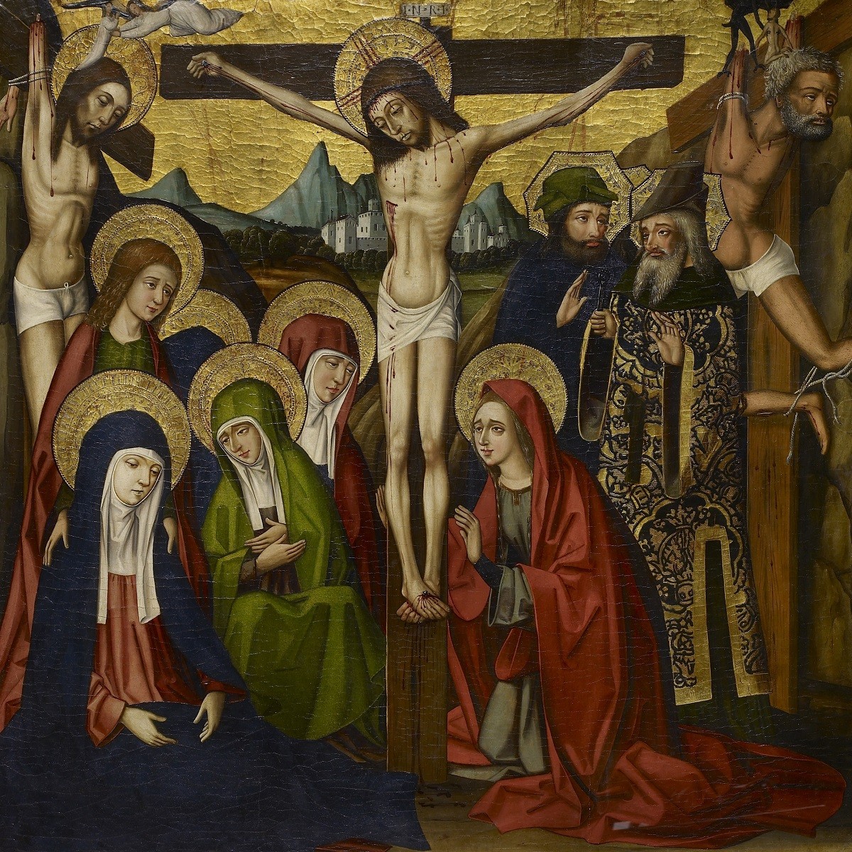
Master of Játiva. The Crucifixion, late 1400s. oil on panel lined with fabric, Overall: 87.9 x 84.7 cm. Gift of Joey and Toby Tanenbaum, 1995. © Art Gallery of Ontario. 95/14.
Meghan Monaghan, AGO Assistant Conservator of Paintings, pointed us towards a 17th-century work, which at first glance doesn’t look to have much blue in it. A foreboding overcast sky looms over revellers in A Village Festival, an oil on oak panel painting by Dutch artist Jan Steen, acquired by the AGO in 2015. Close analysis of a paint sample from the sky tells us about the degradation of a certain blue pigment and how the sky no longer appears as Steen intended. . “Smalt,” explains Monaghan, “is a pigment made from cobalt blue glass that was commonly used in the 17th century, often as an inexpensive substitute for more expensive blue pigments. This Steen painting was treated by our Koerner Conservation Fellow Stephanie Barnes and a technical study of the paint materials was undertaken. The Canadian Conservation Institute in Ottawa did chemical analysis of a tiny paint sample from the sky and found that the blue oil paint contains a mixture of lead white and smalt pigments.
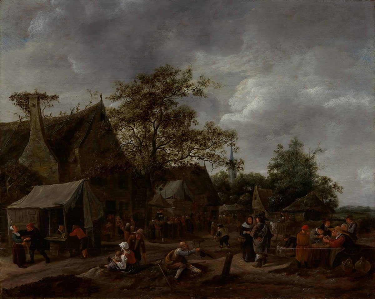
Jan Havicksz Steen. A Village Festival, date unknown. oil on oak panel (cradled), 59.8 × 74.8 cm. Gift of Theresa Redelmeier in memory of W. Robert Redelmeier, 2015. © Art Gallery of Ontario. 2015/225.
“High magnification showed that the smalt particles were no longer blue in colour. Degradation of smalt, leading to discolouration, is a common phenomenon in oil paintings from this period. The chemical composition of smalt changes over time as potassium is leached from the exterior of the particles into the oil medium. A corresponding loss of the blue colour occurs, leaving behind a transparent grey.”
Still searching through European paintings, we were reminded of the scarcity of naturally occurring blue flowers, as they account for a surprisingly low percentage of flowering plant species. With that, another much-admired work came to mind, painted by a central figure in the French Impressionist movement. Gustave Caillebotte—whose use of blues characterizes his work—paints the irises in Blue Irises, Garden at Petit Gennevilliers (1892) with thick strokes on an unlined canvas. Here, in only the second Caillebotte painting acquired for a Canadian public art collection, Caillebotte’s blue is a cool blue-violet, just as he would have cultivated in his garden at Petit Gennevilliers.

Gustave Caillebotte, Blue Irises, Garden at Petit Gennevilliers, 1892. Oil on canvas, 55.2 × 46.4 cm. Purchase, with funds by exchange from the R. Fraser Elliott Estate and the Bequest of F.W.G. Fitzgerald. Purchased with the assistance of a Moveable Cultural Property grant accorded by the Department of Canadian Heritage under the terms of the Cultural Property Export and Import Act; Acheté avec l'aide d'un subvention des biens culturels mobiliers accordée par le Ministère du Patrimoine canadien en vertu de la Loi sur l'exportation et l'importation des biens culturels, 2019. © Art Gallery of Ontario 2019/2268
Of course, no discussion of blue in art is well-rounded without a mention of Pablo Picasso. And, with Picasso: Painting the Blue Period currently on view, it’s fitting we turn to one of his paintings included both in the exhibition and in the AGO Collection to learn more. Picasso’s Blue Period really begins to emerge in early fall 1901 as he was finding his footing as an artist around his twentieth birthday. He visits the Saint-Lazare hospital-prison in Paris and begins making paintings of the women incarcerated there, many of them sex workers suffering from venereal diseases. Like other painters in Europe at that time, Picasso mostly used Prussian blue to paint his cool-toned artworks. Prussian blue, sometimes known as Berlin, Paris or iron blue, was the frugal choice for the struggling young artist in comparison to pricier options like ultramarine. Place it alongside other blues like cobalt or cerulean, and it takes on a darker, almost greenish tint. It plays well with others too, capable of producing both stronger and translucent tones when mixed with other colours. Picasso was specific about the white paints he mixed with his Prussian blue, either choosing zinc white or lead white to achieve the shades he desired. Within each of the works painted during the Blue Period, he harnessed the emotional potency of the colour with its melancholic, sombre and religious associations to depict the plight of the disadvantaged and the downtrodden.
Curated by Kenneth Brummel and Dr. Susan Behrends Frank, Picasso: Painting the Blue Period is co-organized by the Art Gallery of Ontario, Toronto and The Phillips Collection, Washington, DC with the exceptional support of the Musée national Picasso-Paris.
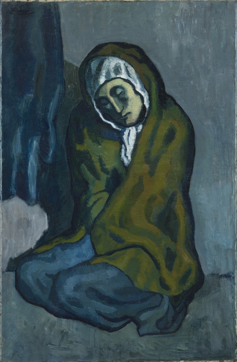
Pablo Picasso. La Miséreuse accroupie, 1902. Oil on canvas, Overall: 101.3 x 66 cm. Art Gallery of Ontario. Anonymous gift, 1963. © Picasso Estate / SOCAN (2021) 63/1.
In actuality, Prussian blue popped up by accident sometime between 1704 and 1707 in Berlin, almost two centuries before Picasso’s first use of it. Johann Jacob Diesbach, a druggist and pigment-maker, intending to make a red pigment called ‘Red Lake’ using potash and cochineal decoction (cochineal insect particles) mixed with iron sulphate, ended up with a brilliant blue when he mixed in a tainted potash believed to be contaminated with traces of animal blood, making it the first-ever synthetic pigment. Refined, and some say under contentious circumstances, by one Johann Conrad Dippel, this new pigment eventually became widely available to artists some 20 years later — its cost-effectiveness making it a good alternative to more expensive ones. Elemental mapping for iron in Crouching Beggarwoman [La Miséreuse accroupie] (1902), acquired by the AGO from an anonymous donor in 1963, shows us exactly where Picasso used Prussian blue to outline the contours of the crouching woman (as seen in the highlights of the elemental map below). Prussian blue was the popular pigment choice for dark blues in 18th- and 19th-century painting. The Conservation Labs featured in the Picasso: Painting the Blue Period exhibition include illustrated legends created by AGO Graphic Designer Marilyn Bouma, whose designs were inspired by the chemical structure of Prussian blue.
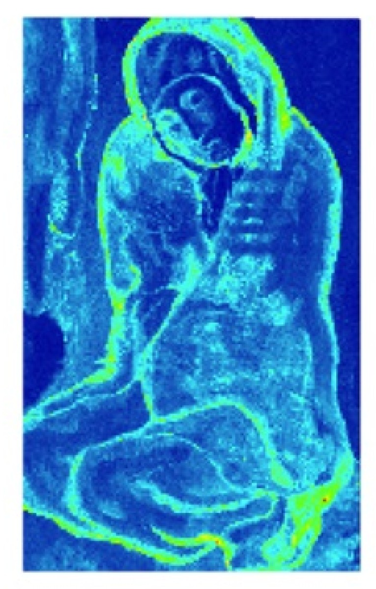
La Miséreuse accroupie (1902), XRF Elemental Map, Fe-K, Image courtesy Northwestern University, Art Institute of Chicago for Scientific Studies in Arts.
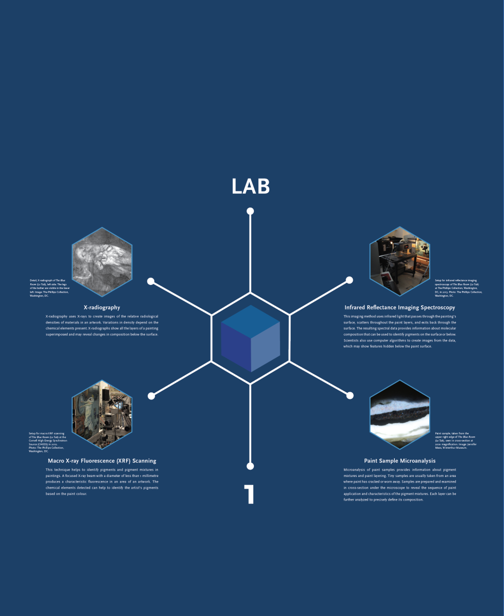
Graphic Design by Marilyn Bouma.
Jumping forward to the 1950s and ‘60s, French painter Yves Klein’s career-spanning devotion to blue is well underway, with the artist going as far as to patent his own matte ultramarine pigment, International Klein Blue (IKB), in 1960. Painting blues this side of the Atlantic around the same time was Japanese-Canadian artist Kazuo Nakamura. A selection of his contemplative abstract works, often permeated with rich blue-greens and blue-yellows, find their home as part of the Thomson Collection on Level 2 at the AGO. Cited as a pioneering Canadian artist and co-founder of the famed Painters Eleven, Nakamura’s work was driven by his exploration of science and mathematics. Using a dry brush technique, bluish-teal paint skims across the canvases of works like his Inner Structure series, Islands (1955) and Landscape (1963).
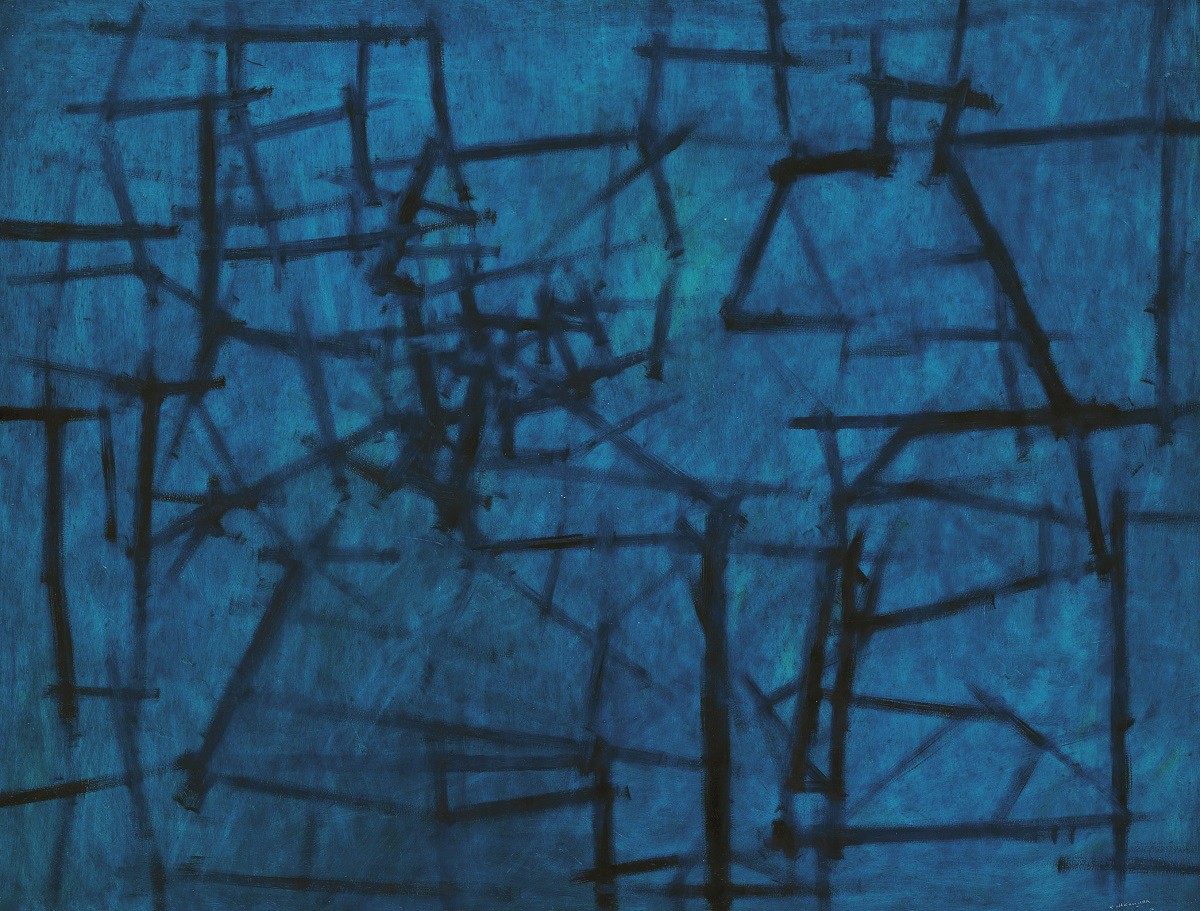
Kazuo Nakamura. Inner Structure, 1956. oil on hardboard, Overall: 60.8 x 78.8 cm. Gift of Mr. Charles McFaddin, Toronto, 1985. © Estate of Kazuo Nakamura. 85/115.
Matthew Wong: Blue View propels us to more recent years with an intensely saturated blue palette on Level 1 of the Gallery, adjacent to Picasso’s masterful expressions. The first museum showing of Matthew Wong’s work features select paintings from the artist’s Blue series with nocturnal landscapes, quiet interiors and serene still lives, all in vibrant shades of blue. Critically acclaimed for his virtuosity during his lifetime and posthumously, Wong’s atmospheric compositions stir familiar feelings of solitude, isolation and vulnerability often associated with the colour blue, while still conveying reverence to his art historical predecessors to inform his distinctive style.
Dig into our story archives for the past entries in the Material Explorations series like this one on silver, this one on linen and this one on plaster. Keep reading AGOinsider for more deep dives from the AGO and beyond.